7-tips-your-video-looking-better

author: @aestranger

Reading time: 8 minutes

7 Easy tips to get your video production Looking better

So many things have to come together in a video production for you, to ensure that your new video looks the best it can be.
The one things I’m often asked and the one thing I always start out with when teaching video production is Composition.

Now many of you purist will probably die inside when I say that what I encompass in a composition is everything from mise-en-scene, to framing, camera shots, and symmetry. Some of them fit in that umbrella term and others barely. But for those who are starting out, need a refresher or didn’t have the benefit of studying Film Production at University for 4–5 years, the term Composition will do just fine.

What I want to do is run you through a few things in this article, and maybe create a bit of a crib sheet for you if you need any reminding.

What you’ll learn about Composition:

  1. Simplicity
  2. Rule of Thirds
  3. Lines
  4. Balance & Symmetry
  5. Framing
  6. Contrast
  7. First of Rule of Film Club

Less is more!

And that’s really all you need to know. But I’ll explain it a bit more anymore.
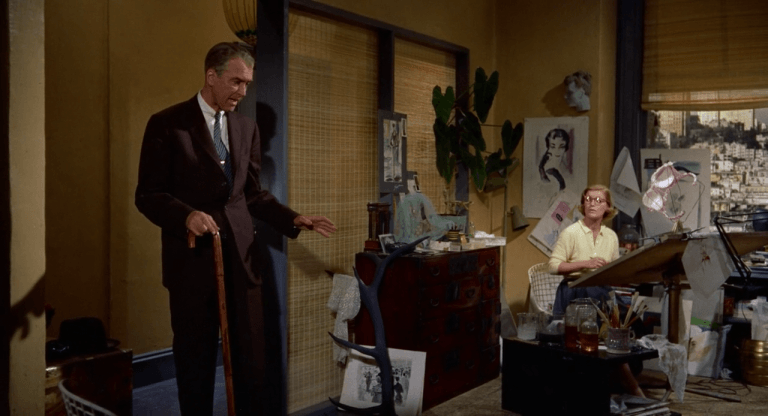
 If you’ve read anything about Hitchcock or Scorsese, you probably know that they put a lot of thought into their scenes. All manner of different meanings and subtexts can be seen around the actors.


The problem that many of you run into is that you think you need to fill the scene to achieve the same thing. This simply isn’t true, if you have a clean and simple shot then the audience can much more easily understand what’s going on in the scene. Adding too much makes the shot chaotic and gives your audience information overload. They’ll subconsciously switch off and not pay attention anymore. And that’s the last thing you want. So less is more. Keep it simple, keep it clean. Follow Lawrence of Arabia’s example:

If you haven’t heard of this rule yet, then you haven’t been looking hard enough. Everyone seems to “know” about it and has definitely heard of it.
Unfortunately, so many people just can’t get it right. Hopefully, this will help you if your one of those people.

Imagine any scene divided into 3’s:

Now internalize those lines into your mind’s eye. Once you’ve done that, internalize where the intersections are. The intersections are what’s important here.They pinpoint areas of interest!

It’s that simple, placing objects, people at these intersections makes the scene more interesting.

Internalising the lines is also important because these can help you divide the image into interesting sections. Sections that can be emotionally motivated or visually appealing.

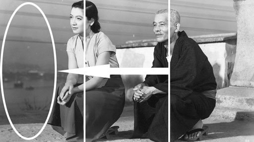
The last tip, which is the most important; always ensure the eyes are near the top line:

If nothing else, remember that the eyes are the most important thing in a shot. You, me, everybody always make contact with the eyes. You can have blurred areas, spaces that are too dark, but if the eyes are visible and exposed, you’ll have a useable shot.

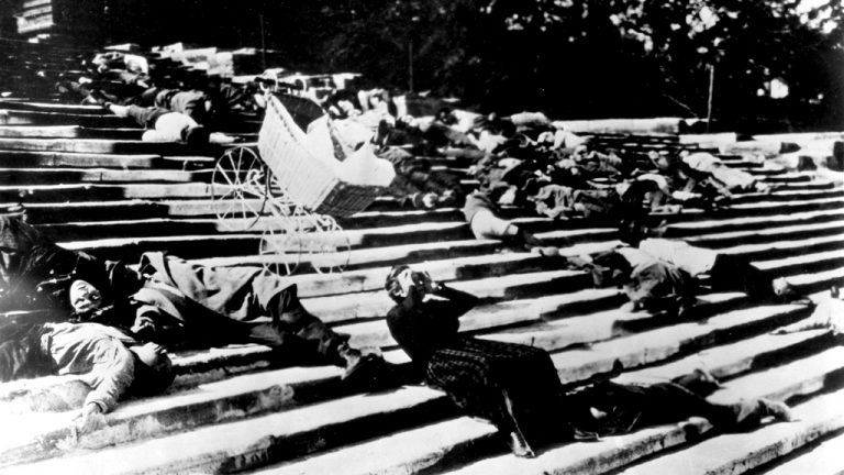
Every shot has lines, if you don’ see any, then you’re not looking hard enough.
Using the lines in a shot are what make the difference between an amateur and a professional when it comes to visual aesthetics.

Lines lead the eye to where you want the audience to look, they also create a sense of depth.
I’m sure you’ve heard of the term, the vanishing point. The vanishing point includes lines that you can use to accentuate foreground and background.

A final point on lines is diagonal lines. Usually, we really only talk about diagonal lines in still shots or static shots, because then they give a sense of motion in the frame. But moving shots can also benefit from diagonal lines. Much like Leading Lines, they direct the audience’s eye line towards where the action will be happening. Think of a great chase scene through a city, the diagonal lines are helping you move along with the subject. 

Every shot has lines, if you don’ see any, then you’re not looking hard enough.
Using the lines in a shot are what make the difference between an amateur and a professional when it comes to visual aesthetics.

Lines lead the eye to where you want the audience to look, they also create a sense of depth.
I’m sure you’ve heard of the term, the vanishing point. The vanishing point includes lines that you can use to accentuate foreground and background.

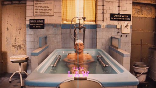
Symmetry is by far the easiest way visually to make something look good. Doing the setup for it is probably the hardest thing you’ll ever do on a production shoot.
For some reason, we as humans are psychologically drawn to symmetrical shots, and therefore we love it when we see it.

The shot below is from The Grand Budapest Hotel, and as you can see it’s perfectly symmetrical, Wes Anderson has even chosen to align the centre of the screen with Jude Law’s dominant eye.

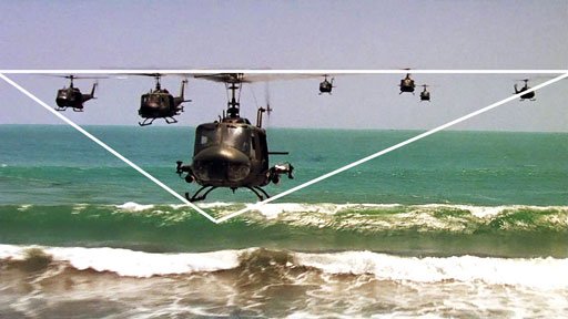
The second-best kind of shot composition is when you use a geometric shape. We don’t consciously see the shape, but sub-consciously our brain is doing its shape-recognition scan, and when it finds a familiar shape, you instantly enjoy looking at it.

One of my favorite composition tools is the Golden Mean or Golden Ratio, I don’t get to use it very often (if ever) but it is something I love looking it.

It very effectively brings everything we’ve talked about above all together. This pleasing ratio of a spiral and rectangles can be seen everywhere in nature, and that probably why we like seeing it. If you take anything away from this, then try bring this ratio more into your shots. Lastly in balance, we need to talk about colour. Colour balance is very important. The colours in your shots need to do 1 of 3 or all 3 things: complement each other, flow with each other or contrast each other. If you know colour theory, then complementary is very similar to contrast, but complementary isn’t binary contrast. Complementary is more red and cyan, where contrast is red and blue, or more commonly black and white. If you can achieve strong colour flow in your shot, then you can deliver a lot of emotion without ever needing any exposition or dialogue. Even the lack of colour can be powerful in a scene.

This leads us onto contrast specifically. Here we’re not only talking about colour contrast but light contrast and object contrast. Contrast can be a wonderfully motivating tool. Keeping some things hidden in the dark and others in the light can have a great deal of different meanings. Is the thing in the dark there to be hidden? Is it evil? Does it need protection? Is it injured? And so on.

Object contract, with the foreground and background, can help you create greater depth in your shots. The best example and one of the first examples of this is in Citizen Kane:

Here we see so many different things happening, it gives us a sense of distance, time, relationships and it’s still a very simple shot.

The Citizen Kane shot also illustrates our final point, that of framing.
 Simple tip, find something in the real world that works as a frame and use it. Two trees with a space in the middle, use the two trees to frame the left and right of your shot.

It’s a very simple trick, you and the audience have been viewing images with frames around them for hundreds of years. We love it when something is framed, it comes back to the idea of symmetry and balance again.

Just have a look at some these shots and just enjoy their framing:

Yes, I know it’s a clichéd line to use, but it’s still fun.
But the first rule of film club is that there aren’t any rules. Not really. Everything is a guideline. Their ways of helping you get to where you want to be, and if doing to complete opposite gets you there as well, then do that instead.

Once you know all these techniques and “rules”, then you’ll be better equipped to experiment and explore. Running out into the world with wild abandon and ignorance won’t help you at all. If you know about looking space, for example, then at least you know what the reason is for an audience’s discomfort if you don’t provide it for them. Now you know they are uncomfortable with your choice of composition, use that to accentuate an emotion in your shot. Use that knowledge to make your film go from good to great!

I hope you enjoyed this quick run through of some easy tips for better composition in your film productions.

Please do share this blog if you found it helpful or if you know of someone who might find it helpful as well. And please do contact us if you wish to see more blogs like this or if there are topics you’d like us to explore.

If you enjoyed this blog, then don’t hesitate to contact me with any queries or requests. Please do Share if you found it helpful and know someone who would it find it helpful as well.

I hope that this piece has given you some food for thought and helped improve your own methods or at least offered a different viewpoint to consider.

Please do check out the other posts on æStranger.com, and please do leave a comment or contact us if you have some ideas of your own that you wish to discuss or if you would like to see other topics discussed.

Please do Share if you found it helpful and know of someone who would it find it helpful as well.


LinkedIn
Twitter
Facebook
WhatsApp

One Response

Leave a Reply

This site uses Akismet to reduce spam. Learn how your comment data is processed.

before you go!

Before you go and grab your copy of Press Start, would you like your free White Paper on how to better engage your audience and other bonuses?

This site is protected by reCAPTCHA and the Google Privacy Policy and Terms of Service apply.
Before you go!

Before you go and grab your copy of Press Start, would you like your free White Paper on how to better engage your audience and other bonuses?

This site is protected by reCAPTCHA and the Google Privacy Policy and Terms of Service apply.