top-tips-color-correcting-videos

author: @aestranger

Reading time: 9 minutes

7 Top tips when you’re color correcting your videos

The one thing you probably never think of or notice when watching a video is color. At least not when it’s done well. When you watch something that doesn’t have good color balance you notice it immediately.

What I’d like to do is to quickly take you through some basic ideas around color correction and color grading. If you’re just starting or just don’t have enough time to spend hours on getting that perfect look, then hopefully this will aid you.

What you’ll learn in this blog:

  1. Difference between correction and grading
  2. Monitors & Software matter
  3. Using graphs
  4. Exposure
  5. Varying camera images
  6. Saturation & Vibrancy
  7. Colour Stylization

Colour grading vs. colour correction

Colour correction is the first thing you do with any footage you’ve shot. What the term boils down to is that you are making sure that every shot has a similar white balance, contrast and color range. We’ll go into each of these a bit later.

Colour grading, on the other hand, relates more to creative choices that are made on the look of the video. Here you’ll choose what color tone you want your footage to have, for example, The Matrix had a slight greenish tint whenever the characters were inside the Matrix. Outside in the real world, everything had more natural colors.

The Matrix

The Matrix — The Wachowski Brothers

Or the juxtaposition of the color balance in The Aviator. Where the start has a somewhat strange color balance while Howard Hughes is still relatively sane, and the color balance normalizes at the end when Howard Hughes is mentally unstable.

The Avaitor — Martin Scorsese

Color correction tends to be something you will always need to do with any video. Color grading, on the other hand, is only if you want to convey a specific theme or emotion through color in your video.

Getting a good monitor and the right software

When you are editing a video it’s always a good idea to have a good monitor, it’s even more important when you’re doing color correction/grading.

I’m not going to tell you which monitor to buy as that is dependent on your own personal budget, but I will give a quick tip to check whether you have the right kind of monitor.

When buying a monitor ensure that it does at least 90% of the range for sRGBor REC.709 color space. Both are important as they tend to be what most HD monitor or projects will display your video at.

UHD monitors and projectors will very soon start using REC.2020, so if want to get ahead of the game, then I suggest looking for what that fits within that category.

As far as software goes, yet again you will need to decide how much money you want to spend on software. But if you’re thinking about doing video recording seriously, then you probably have some decent software.

Premiere Pro and Apple’s Final Cut both have very decent color correction software already with them. These are very intuitive and easy to use and do a decent job.

Luckily though if you are strapped for cash, BlackMagic do have DaVinci Resolve Lite, which is a free and incredibly powerful color correction program. I would highly recommend downloading this and use this when color correcting. It is a somewhat advanced piece of software, but it’s easy to get used to and there are enough tutorials on YouTube that can help you.

Do remember to make sure your PC can handle the DaVinci software though, not that you download it and find out you can’t use it…

Using graphs will make your life so much easier!

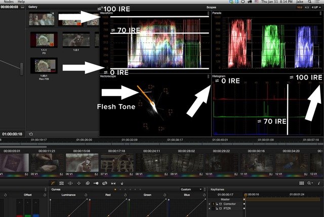
There are 3 graphs that you need to utilize: Waveform, Histogram, and Vector graphs. I recommend you fully learn what each one does, as I’ll only be covering what to look for to achieve a quick color balance from them.

The biggest advantage of understanding the graphs is that if you can’t afford or don’t have a monitor that hits the right colour spectrums then you can intuitively work from the information the graphs are giving you and still effectively colour correct, colour grading may be more difficult as that is more personal preference that raw data.

The 3 main areas that you’ll be looking at in any shot are the Shadows/Midtones/Highlights. Each program calls this list of luminescence variations slightly differently, you may also see Blacks/Mids/Whites or Lift/Gamma/Gain. They are virtually all the same, and some programs may even give you the option to jump between various of each one.

The best way to find out what each one does to your shot and what type correction is being given is by experimenting. I generally test it by putting each setting to the extreme and then back. Now that I have a benchmark I can adjust to what I need.

Using the graphs, there are a few easy tips to get you started in balancing your image to a more neutral state. In the Waveform and Histogram graphs, you’ll see that all the information lies between 0 and 100 IRE. Use the tools for the Shadows/Blacks and the Highlights/Whites to bring in line between the 0 and 100 spots.

So, Shadows should only really hover just above 0 IRE and Highlights should be dropped so that they are just under 100 IRE. This will ensure that nothing is dropping outside of the broadcast range for your image.

Midtones are a little trickier, we’ll explore these a little bit later, but a basic rule of thumb is that mid tones should reside between 60–70 IRE. Don’t worry though, changing the mid tones has very little, to no effect on the position of the Shadows and Highlights.

Do remember though that you need to do these type of basic white balancing techniques before you move on to color grading. Especially if each shot has a slightly different white balance, your grade will not be uniform then.

Correct exposure is a must

Depending on what type of camera you have, it’s a very good idea to shoot log. This will give you a flat image that is much easier to color correct and grade, as most color and light information is preserved in the image. If your camera can shoot raw, then that’s even better.

If you’re unsure if your camera can shoot log (which almost every decent camera can), just google it and see if there’s a pre-set you can download to allow for this. I know that Canon and Nikon DSLR’s have a very enthusiastic community, and many people have created downloadable user presets to allow you to shoot in log.

But shooting in log doesn’t solve every problem, you still need to make sure you’re exposing correctly. And this seems to be very difficult for a lot of people. If you don’t want to be like everyone else then make sure you’re getting well-exposed shots, and if you’re not sure what needs to be exposed, then always make sure you’re exposing for the skin.

Skin tones, regardless of race, ethnicity, etc… reside between 60–70 IRE on the graphs, if you have a fairly good camera it should hopefully have a function to switch on the zebra lines. This will overlay zebra lines onto your viewfinder image, showing you what is being exposed correctly and what isn’t. Make sure the zebra lines function is set to 70%.


Should be easy to remember that way, 70% zebra lines for 70 IRE in the graphs. You can’t go wrong then.

Multi-Camera colour correction

At some point, you will probably run into the issue where you’ve done a multi-camera shoot, but you couldn’t get the exact same camera for each part of the shoot. Unfortunately, every manufacturer has their own version of what the color space should be like.

Therefore, the majority of your color correction and color grading will be to line up the various into similar color space, only after you’ve done that can you actually move on to giving your video a stylized color grade.

Colour saturation & vibrancy

When you’re working on multiple images from multiple cameras and trying to align the balance between each one, you might start to notice that the image is becoming a little gray. Not to be confused with a flat image though.

When you start lifting the blacks, dropping the whites and playing around with mid tones, the color can start to disappear a bit. What you need to do then is to have a look at a saturation filter, and maybe a vibrancy filter. Vibrancy is more of a personal choice and can fall under stylization. But saturation will bring some of the colors back into your shot. Be careful though as many saturation filters require a light touch, you don’t want your footage looking like a 1970’s Betamax throwback.

The most important colors to keep an eye on are the flesh tones, you never really want these to disappear completely (unless of course, you’re doing a black and white, then, by all means, get rid of that color).

Your best bet to keep an eye on flesh tones is the Vector graph, which has an area in it that is known as the flesh tone region. It resides roughly between the yellow and red indicators, around where orange would be.

Contrary to what many believe, the flesh tone is true of any ethnicity. We’re dealing with flesh tones, not skin color. As far as the camera sensor and we’re concerned, you’re exposing and balancing for color, rather than looking for what types of pigment the eye registers.

Colour stylization

Finally, we get to color grading!
As you’ve read, grading is a style choice. It’s a choice that you as the colourist, director make so that you can set a specific tone to your video. Some of the examples we’ve mentioned are The Matrix and The Aviator. Most science-fiction and fantasy films tend to have a specific color grade so that they accentuate a certain feel or era.

But there are also color grades that not only denote a genre but also a trend. For example, the most popular color grade in Hollywood at the moment the Teal-Orange grade. Here you’re pushing the shadows towards the Teal part of the spectrum, and the mid tones to the oranges, and the highlights slightly to the yellows. Now that you know it, you’ll start seeing it everywhere. The most obvious one is any Michael Bay movie, especially the Transformers franchise. The blacks in those movies are practically blue.

Transformers 2 — Michael Bay

A few other tricks to stylize a shot is by using vignettes and masks. Generally, you would use these to accentuate certain areas. Lighten the area around the eyes to focus the audience’s gaze upon there, or darkening a sky while maintaining a visible ground. Or what you will often see in advertisements is where a mask has been layered over the product so that it maintains the brand’s colors while the rest of the shot is stylized a certain way.
This will often lead to the bonus of the product popping in the shot. Think of any Coca-Cola ad and you’ll notice what they’ve done.


This was a fairly short run down of how to do some easy color correcting if you’re starting out with making video’s, online or offline. Grading is a little more subjective. I’d recommend looking up some color theory and seeing what emotion fits with what color. That’s a great starting point. Color CC from Adobe also gives you a way seeing what colors are complementary. Which you can then use a benchmark to determine your own unique style.

I hope this piece was helpful to you. If so, then please do share it, or if you know someone who could benefit from it, then please share it with them. If you’d like to see more of these types of posts then please do drop us a line and let us know what topics you would like to see in the future.

I hope that this piece has given you some food for thought and helped improve your own methods or at least offered a different viewpoint to consider.

Please do check out the other posts on æStranger.com, and please do leave a comment or contact us if you have some ideas of your own that you wish to discuss or if you would like to see other topics discussed.

Please do Share if you found it helpful and know of someone who would it find it helpful as well.


LinkedIn
Twitter
Facebook
WhatsApp

17 responses

  1. I like how you said that color grading is choosing colors to set the tone of your film or video. I would love to have that kind of creative freedom in my videos so that I could evoke the emotions I’m going for! I’ll have to see if I could get some color grading software to help my videos become what I’ve always pictured they’d be.

  2. I really appreciate your article…keep up the good work buddy…
    This tips are very helpful. I do think it is a good way to reach consumers…Thank you for sharing this! It does give a new insight in success….
    Have a nice day…

Leave a Reply

This site uses Akismet to reduce spam. Learn how your comment data is processed.

before you go!

Before you go and grab your copy of Press Start, would you like your free White Paper on how to better engage your audience and other bonuses?

This site is protected by reCAPTCHA and the Google Privacy Policy and Terms of Service apply.

Before you go!

Before you go and grab your copy of Press Start, would you like your free White Paper on how to better engage your audience and other bonuses?

This site is protected by reCAPTCHA and the Google Privacy Policy and Terms of Service apply.